![]()

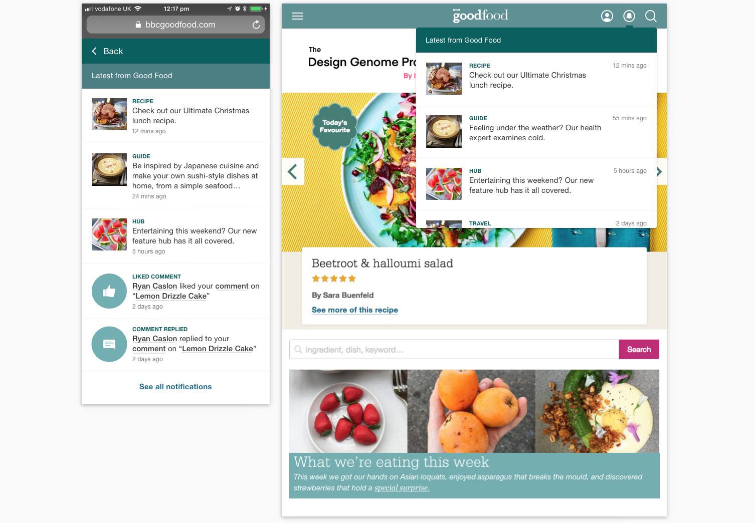
Notifications on bbcgoodfood.com
UK’s number one cookery brand
Background
First task when I joined GF, how can we:
- Increase traffic to article content?
- Increase page views per session?
- Increase return visits?

Research
Know my product
- Competitor analysis – what do other food sites offer?
- Chat with editorial team – understand editorial work flow
- Analysis current user journey
Problems
- Found a recipe – cooked – did rating – commented – ‘the end’
- No return feedback
- User does not get notified when their comment is ‘liked’ or ‘replied’
“Help your user, your user will help you back”
AMP Roadshow
Objectives
After several meetings and whiteboard sessions, we have our objectives on ‘What makes a good notification’
- Notifications must add value by:
-
Notifying users of info they care about
-
Notify users about not missing things
-
-
They must encourage users to come back regularly and consume more content
-
They must make people aware of the breadth of content available on BBC Good Food
-
They must not annoy (spam, overlap with other message channels).
Design Process
Competitor analysis
-
Look into different sectors
-
Look into logic, how it behaves
-
How it displays on both mobile and desktop
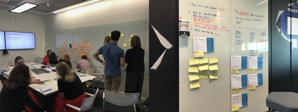
Organise workshops to get ideas on user and business needs
-
What would users like and not like to receive
-
What kind of content would the editorial team like to send out
First Phase Design Development
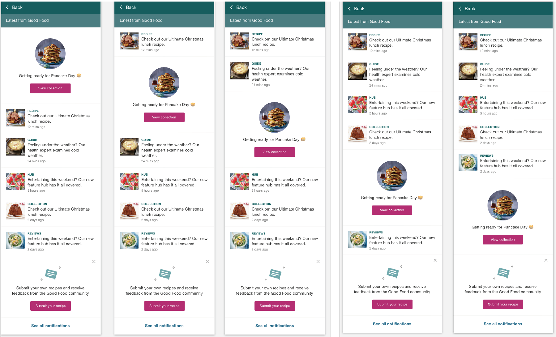
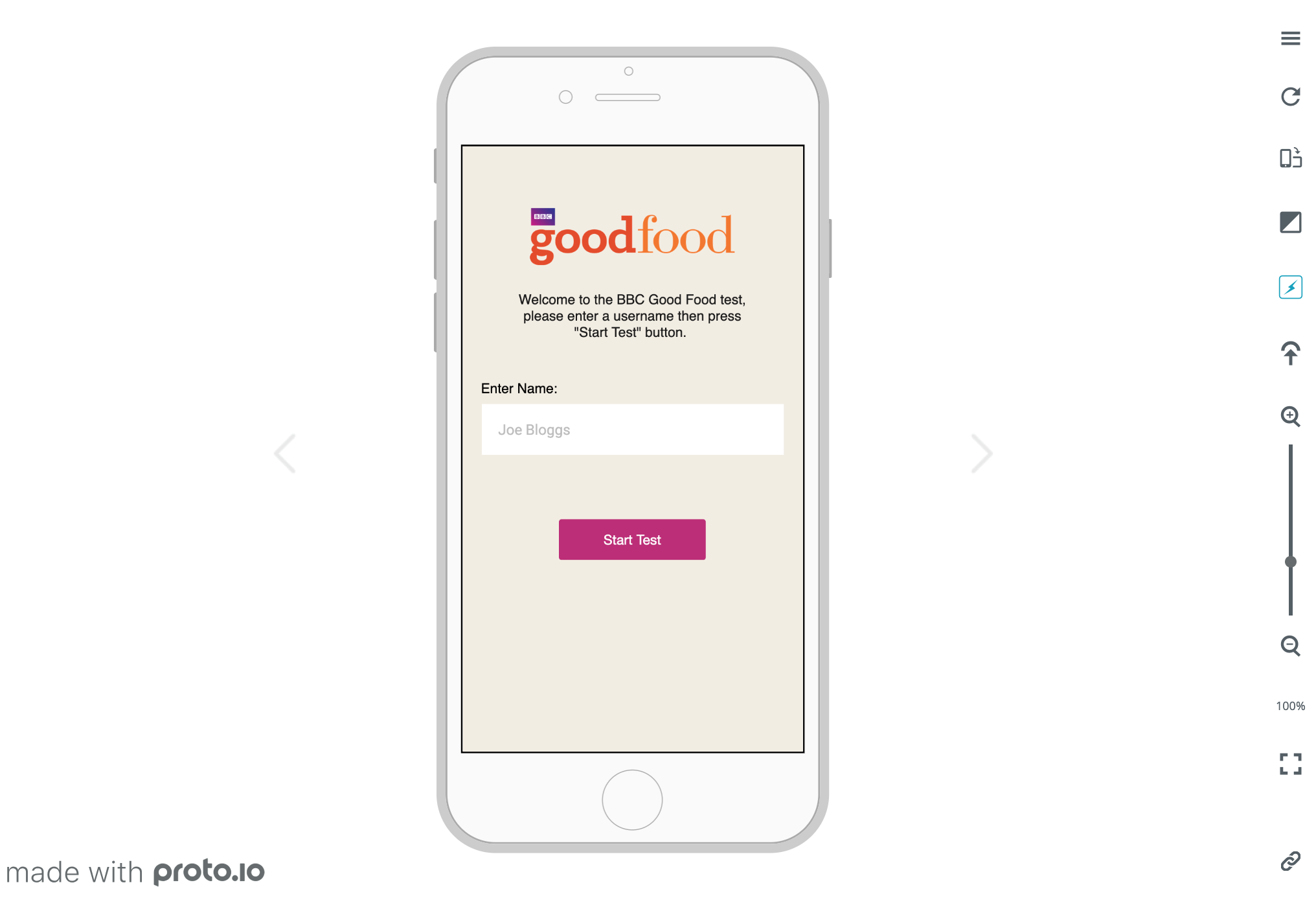
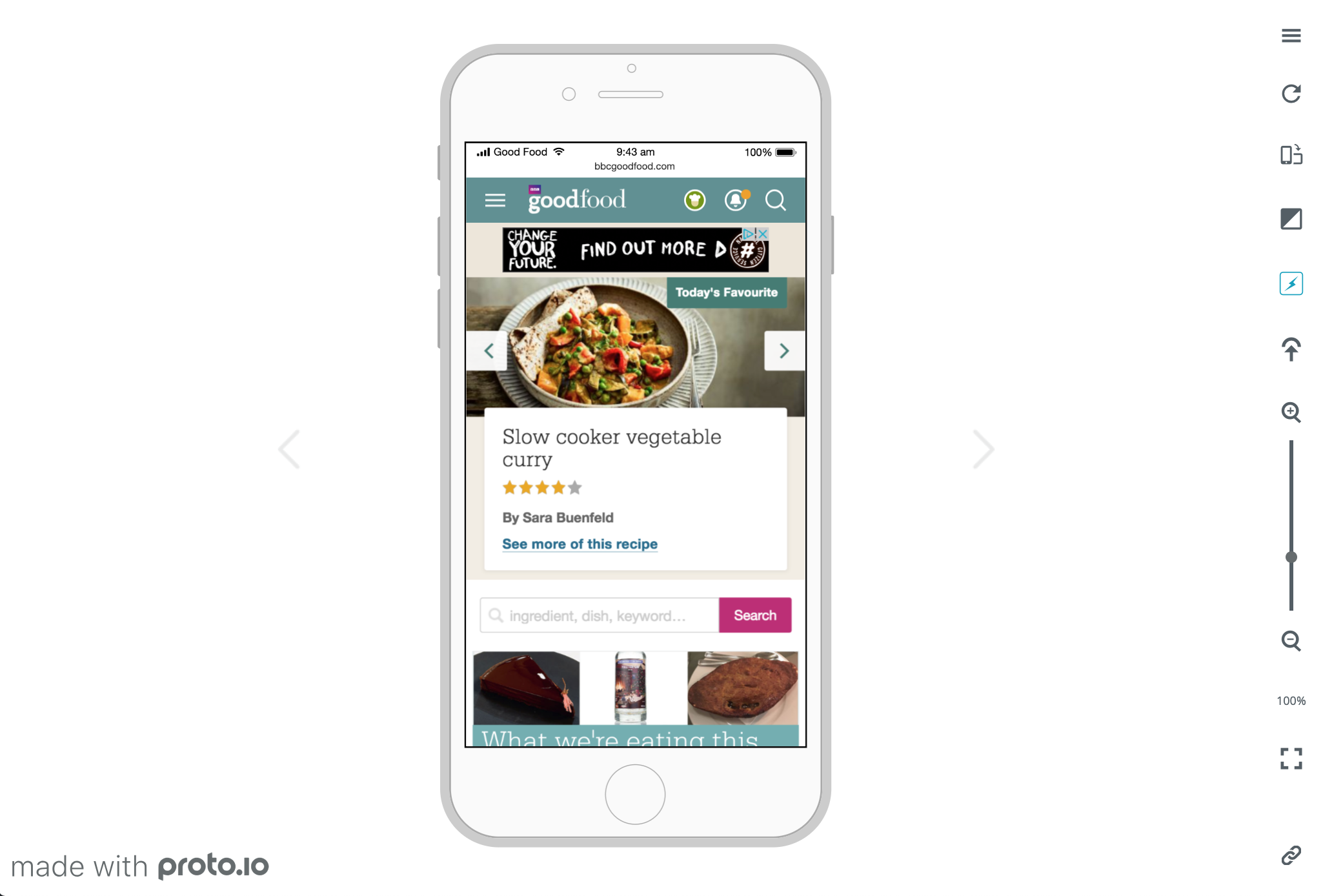
Building prototype for user tests to explore user interaction with ‘Notifications’
- First phase wireframe to focus on mobile first
- First phase UI to define styling and how will it fit within current website
- First phase clickable prototype for user testing to define behaviour
First phase user test (remote user test with 10 GF users)
-
Will you notice the alert dot?
-
Would you guess what it is?
-
What would you expect to see after clicked?
-
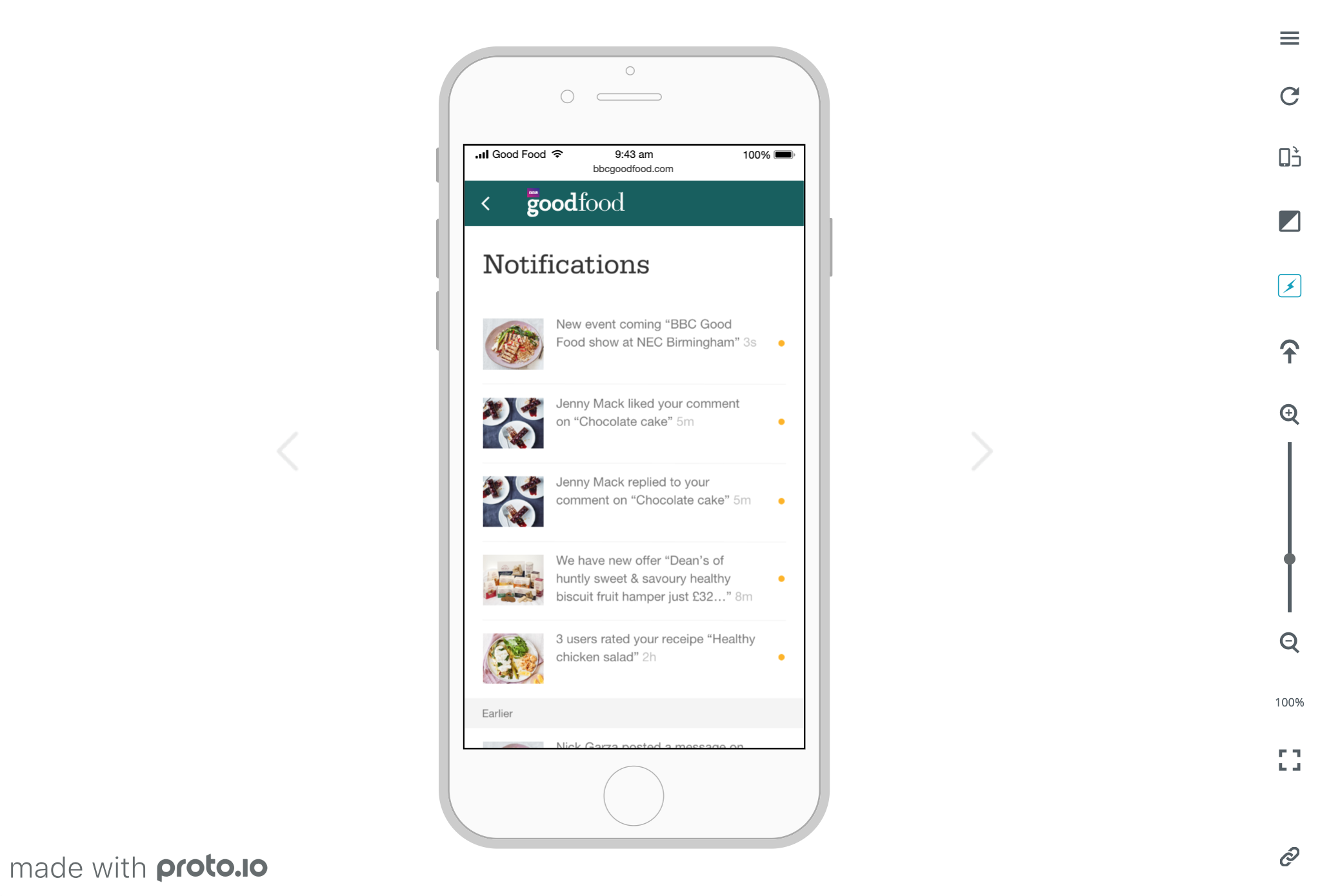
What do you think of the Notifications page?
-
What do you expect when you click on one of the notification?
What did we find out
-
Users understand what is the icon and the alert dot for
-
Users understand the notifications page
- Positive feedback on profile related feeds
-
Users prefer not to have promotion related feeds
Second Phase Design Development
Define MVP
Content and Data
- Define data we could use for feeds (Rating, saved recipe, comments, replies, competition etc…)
- Content grouping (profile, editorial and admin)
- Define the amount of feeds we send out
Frequency
-
Define the amount of feeds we send out (by hour? by day? by week?)
- How many feeds to show in a page?
Event logic
-
Define duration of a feed (where does it go when it expires)
- Define behaviour for logged out (anonymous) and logged in user
-
How does a user get notified? (what triggered it)
User flow
-
-
Define click areas, for example should user name be clickable, and where does it go?
-
Design transition from a state to another state
-
Second phase UI
-
-
-
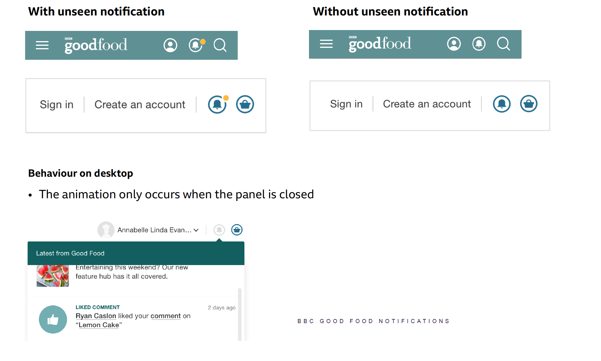
Surfacing ( anonymous and logged in state )
- Finalise icon for the new feature (notifications)
-
-
Second phase user test -AB Test (Notifications MVP)
-
-
-
Objective of this test is to see how users interact with different types of editorial notification.
- Does position impact clicks? For example top 2 feeds will get more clicks than the rest.
- Tested with 5 editorial contents, mobile only, for logged in and out users.
-
-
What did we find out
-
-
- Not all users noticed the new feature (simple animation with orange alert dot popping out)
- For users that has clicked on the icon, they interacted with the notification contents
-
Third Phase Design Development
Make User Click
Gather all possible ways of notifying user on the new feature
-
-
- Pop up message
- Joy ride
- Design trick (position, size and colour)
- Animation
-
Micro animation
-
-
-
Research on possible tech to implement micro animation
- Define a best way for us – we want it smooth and sharp
-
Animation prototyping
- GIF (not optimise across platform, blur graphic on some platform)
- SVG SMIL animation (easier to produce but not support on part IE )
- CSS with SVG graphic (easier to produce but not support on part IE )
- CSS with CSS drawing (a bit challenging but it work well across all platform)
-
-
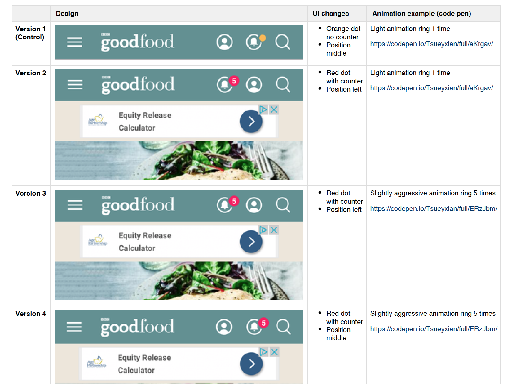
Third phase user test – AB Test (Make user click)
Objective of this test is to make users click on the bell icon. We are testing 4 variations on the bell icon.
-
-
-
-
- With this animation (https://codepen.io/Tsueyxian/pen/ERzJbm)
-
Mobile only
-
For logged in and out users
-
Tested with 4 editorial contents
-
Traffic 20%
-
Duration of 2 weeks started 2 August 2018
-
-
-
What did we find out
-
-
-
- All variations reached 99% statistical significance, which says new animation increases clicks.
- We discovered early signs that content sequence within notifications was not critical as users would skim read to select notification that interested them.
-
-
Documenting
- Record all work we have done on ‘Jira’
- Create pdf for presentation to stakeholders
Design hand over
- Organise sit down sessions with developers to go through work we have done
- Tidy up and pass over all design files
Project currently in development.
Designed during my full-time employment at BBC Studios who owns full rights to the project.